Creating a lasting impression on others by standing out with my brand seemed like a huge challenge to conquer. I wanted to create a style that breathed “Me!” while also being professional but fun, and have it fulfill my own uniqueness.
I did my best to tackle this challenge by choosing the basics, like font and colors, then I moved on to my logo, finding something I could be attached to was my goal.
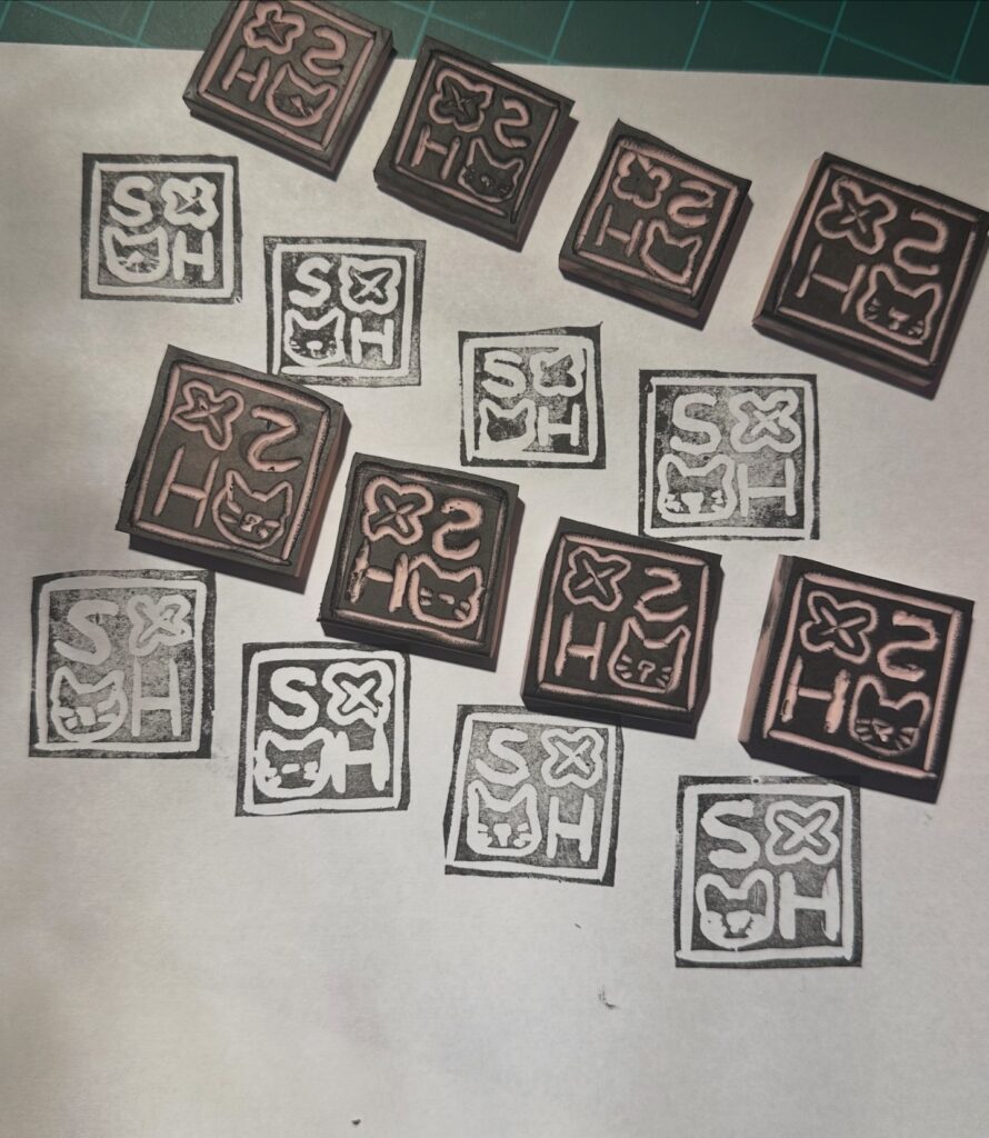
To the left, you will see my final logo design, deeply inspired by Japanese hanko, or personal stamps that are used in place of a signature on legal and business documents. I do not have any Japanese heritage, but I feel really inspired by Japanese culture and wanted to take the concept of a hanko and make it my own, as you see here.
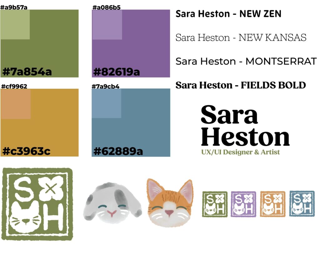
Here is my overall color palette, fonts, logos, and icons I came up with for my brand. I decided to go with Fields, bold for my main branding font, such as using it for my name and info on documents like business cards, letterheads, and logos. But I use Montserrat for body text on everything else. For logos, I still use my stamp design, but I like to incorporate different colors for it, as well as characters, such as my rabbit Darwin and my cat Buster, since I’ve illustrated them in a lot of my personal work, plus they are my pets.
I think my brand has my passion in it, as well as notes of my personality and work, so I’d say the challenge is completed!
Creative Process

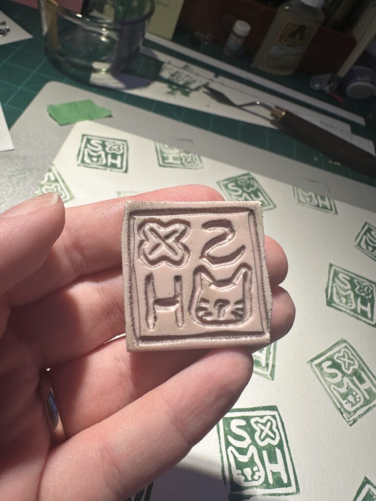
In my creative process, the first approach I usually try is illustrating in Procreate on my iPad. It’s a tool I use the most besides the Adobe Creative Suite and traditional sketching, plus I was able to decide on the colors I wanted to use right away. To the left, you can see my first logo design, which was much more similar to the Japanese hanko stamps, and I quickly created what is most similar to my current stamp.
I actually took the final square drawing I created, image-traced it in Adobe Illustrator for digital formatting, and made a real stamp for physical work!
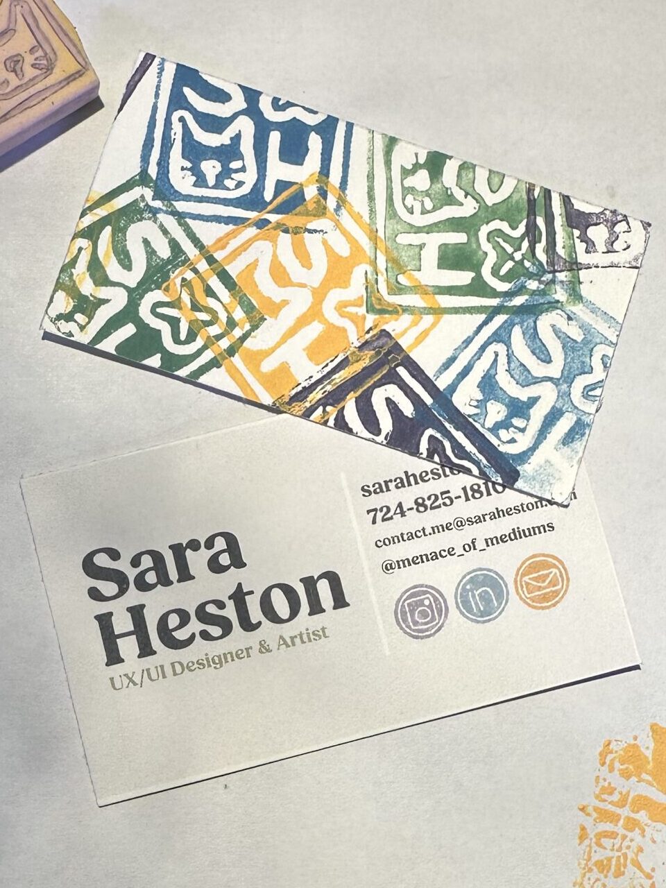
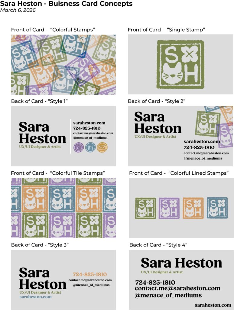
To the left is the design for my business card. I decided to actually create a real stamp of my logo, mixed the paint to match my color palette as best as I could, and I printed the cards on heavy watercolor paper. I am really happy with how it came out, and I feel that it reflects my style as an artist as well as the effort I put into my work.
For the back of the card, where my information is, I illustrated the social media logos instead of using vector icons to add an extra layer of texture and personality in a handmade way. Making sure colors were consistent throughout.